Opinion
wikimedia.org

Every map you’ve ever seen of Africa is right

Would new maps that depict the continent’s size more accurately really change our attitudes about it?

June 21, 2015 2:00AM ET

With all the deadly serious issues of social and economic injustice confronting Africa, it’s amazing how many people remain concerned with the continent’s size on our maps. If you’ve heard of the Mercator projection, the term for the ubiquitous rectangularly rendered maps found in almost every American classroom, you probably know about its flaws. Most egregiously, critics note, it distorts the world by making Africa look much smaller, relative to other continents, than it really is.

The anti-Mercator case continues to fascinate us, making regular appearances in outlets as diverse as The Economist, Upworthy, The Guardian and Business Insider. But it may be best remembered from a 2001 episode of “The West Wing,” in which an enthusiastic academic tells the White House that the Mercator map has “fostered European imperialist attitudes for centuries.” As he explains, “In our society we unconsciously associate size with importance and even power. When third world countries are misrepresented, they’re likely to be valued less.”

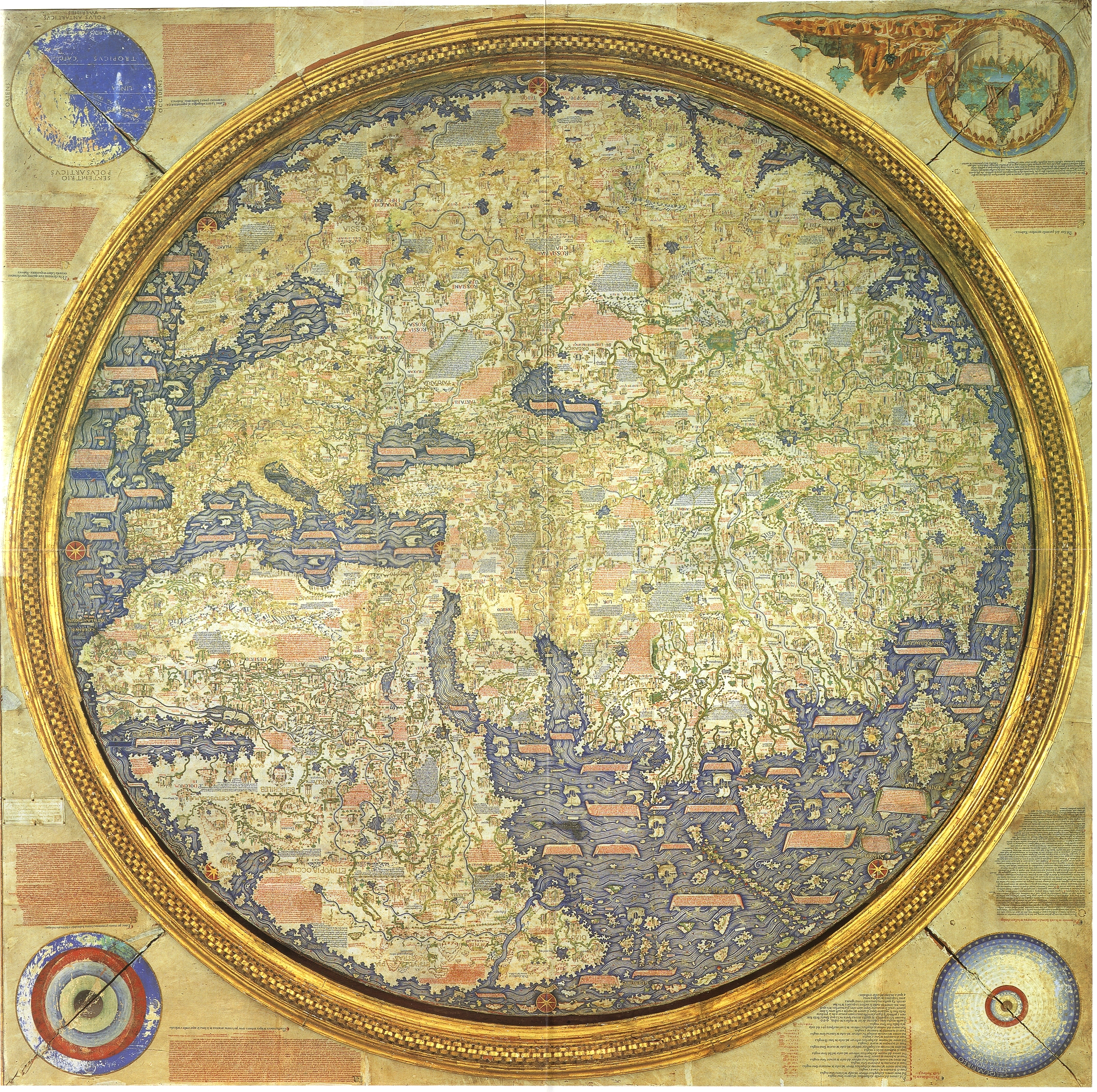
Is the Mercator projection to blame for bad public policy and geographical ignorance? It is true that the almost universally used Mercator world map (named for Gerardus Mercator, the 16th century cartographer who created it) relatively reduces the size of regions near the equator and expands the size of areas near the poles. Greenland, for instance, appears roughly the same size as Africa, even though Africa’s actual land mass is 14 times Greenland’s.

There is little doubt that, in the absence of other evidence, this affects our perceptions of how big Africa is. If nothing else, we assume that map size is generally correlated with real size. That’s why walking across Manhattan can seem pleasantly quick after looking at the extra-wide New York City subway map.

But does this really have a pernicious effect on our political and social views? Upon reflection, the idea of a subconscious cartographic conspiracy against Africa doesn’t hold up. Like some hybrid of a scapegoat and a red herring, it may actually let us off the hook. Let’s stop blaming our maps and confront the fact that our prejudices about the continent are so deep-rooted that they don’t need any cartographic corroboration.

“View of the World From 9th Avenue.”
hoodedutilitarian.com

I first sided with the Mercator against its critics when, on one of the rare occasions I thought about Greenland, I realized just how rarely I thought about Greenland. Despite seeing it hanging there like a giant icy sword of Damocles atop every wall map, we just don’t seem to care about it. Antarctica, too, is massively inflated on the Mercator, to the point that it’s as big around as the entire earth. But few would argue that mapmakers intended to depict it as a superpower. Meanwhile, if maps lead us to ignore Africa, they should also lead us to treat cartographically bloated Canada as one of the most important countries in the world. We don’t.

Or consider illustrator Saul Steinberg’s famous New Yorker cover, “View of the World From 9th Avenue” which imagines a map in which size has been altered to conform perfectly to perceived significance. In a counterintuitive way, his cartoon serves as a reminder that no matter how hard every Mercator map of the United States might insist on the importance of Kansas, Manhattan residents remain unconvinced.

Imagine that the Gall-Peters projection, which emphasizes Africa by more accurately representing land area, replaces the Mercator in every classroom in the U.S. In order to get Africa’s size right, it must distort its shape more dramatically than it does the shape of the U.S. Because Africa is closer to the equator, it gains map size by being elongated, thus distorting relative distances on the continent. How would that change our attitudes about Africa’s importance? If Africa were suddenly a lot bigger, would we credit it for being more powerful than we think it is, or might we just question why, despite its size, the continent isn’t richer or stronger? 

The Gall-Peters projection emphasizes Africa by more accurately representing land area. In order to get Africa’s size right, it must distort its shape more dramatically than it does the shape of the U.S.
wikimedia.org
A colonial-era British propaganda map showing the queen's dominions.
Stephen Luscombe / www.britishempire.co.uk

Of all the problems with criticizing the way our maps depict Africa, the most ironic is that it ignores the continent’s history of colonialism. Consider the motives of a colonial-era British cartographer — perhaps the kind of guy who made this bold, colorful propaganda map (right) showing off the queen’s dominions.

His incentive, if anything, would have been to make Africa appear as large as possible, since Britain then ruled a large share of it. With India along the same latitude, expanding the size of the earth’s equatorial region would have been a perfect way to color more of the map imperial pink.

Or what about this remarkable Portuguese map (below), which superimposes Portugal’s African colonies on a map of Europe to argue that Portugal doesn’t look so small anymore?

This map superimposes Portugal’s African colonies on a map of Europe.

When you consider that most of Africa was under European imperial rule for large parts of the 19th and 20th centuries, the idea that Eurocentrism drove our adoption of the Mercator map suddenly appears anachronistic.

But the biggest flaw in Mercator critics’ argument is that Africa is small on the map precisely because it appears right in the middle of it. Especially when the U.S. appears in the upper left corner — another point of complaint for many of the same critics — Africa ends up in the very center of the map. For much of cartographic history, this was the position of prime importance. Just consider some of the surprisingly earnest American attempts to make Indiana the center of the world in the 19th century. 

A stylized image of three continents meeting in Jerusalem. (Click on image to enlarge.)
wikimedia.org

Prioritizing the map’s center goes back much earlier. Before Galileo Galilei or Charles Darwin, tension arose between the pious and the scientifically minded when Renaissance mapmakers, realizing just how big East Asia was, concluded that Jerusalem was not the geographic center of the Old World. Compare these two 13th century maps — a stylized image of three continents meeting in Jerusalem (right) and a sprawling world centered on Christ enthroned in the holy city (below left) — and this more accurate 15th century depiction of Eurasia (below right), with Jerusalem a little off center.

Eventually, particularly after the discovery of the New World, even the most pious appear to have moved on.

A sprawling world centered on Christ enthroned in the holy city. (Click on image to enlarge.)

That the standard classroom wall map doesn’t get much praise for making Africa the center of the world suggests that our mental geography may be too deeply ingrained for maps to challenge — much less shape — it. Maps influence our view of the world, but our view of the world also influences how we see our maps. Meaning that the really important biases are often not on maps but in the heads of the people looking at them. If Americans think Africa is important, they read the map accordingly. Whether your worldview is informed by 13th century piety or 19th century imperial acquisitiveness, that worldview determines how you see a map more than what is actually on it. Anyone concerned about Africa should consider the possibility that changing minds, while harder, will ultimately prove more effective than changing maps.

A 15th century depiction of Eurasia. (Click on image to enlarge.)

It’s good to realize that every map contains distortions and to correct for this by looking at alternative projections or a globe every so often. It’s even fun to discover, as anyone with a see-through map as a shower curtain probably has, that the world would look different to a band of subterranean mole men looking out, just as it does from inside the shower.  

But we shouldn’t worry so much that subliminal cartographic signals will distort our thinking. More dangerous, perhaps, are the political positions mapmakers don’t feel the need to hide. When her Britannic majesty is sitting firmly atop the globe (as in the famous map below) or the armored fist of American nuclear power is shaking lightning bolts above it (as in the underappreciated logo for the U.S. Strategic Command), does the size of the continents really matter? 

wikimedia.org

Nick Danforth is a Ph.D. candidate at Georgetown University. He writes about Middle East maps, history and politics at Midafternoon Map.

The views expressed in this article are the author's own and do not necessarily reflect Al Jazeera America's editorial policy.

Related News

Places
Africa

Find Al Jazeera America on your TV

Get email updates from Al Jazeera America

Sign up for our weekly newsletter

Get email updates from Al Jazeera America

Sign up for our weekly newsletter