
Unemployment is under 7%. So why aren't 93% of Americans working?

(This post originally appeared on LinkedIn Influencers. Follow Ali Velshi on LinkedIn.)
Ok, suspense junkies, listen up!
The Oscars are over and March Madness hasn’t begun yet, so I have a chance to direct your fleeting attention to what economic geeks like me consider this month’s real event: the release on the first Friday of every month of several key pieces of information about the health of America’s job market. Allow me to give you my take on which employment statistics are superstars, and which ones are supporting actors at best. (Not there’s anything wrong with that, Jared Leto.)
Ali Velshi
Let’s start with what I, and most economists, consider the real star of this show — and it’s not the Unemployment Rate over which so many people swoon. The most important number we get every month comes from something known as the “Establishment Survey” conducted by the Bureau of Labor Statistics, which is a division of the Department of Labor. Also referred to as “Nonfarm Payrolls,” this survey polls approximately 144,000 private businesses and government agencies about their workers.
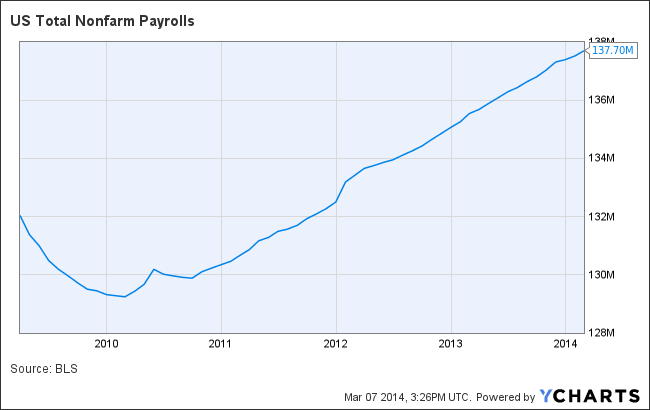
US Total Nonfarm Payrolls data by YCharts
The beauty of the Establishment Survey is that it produces a straight, representative count of the number of jobs created or lost in a given month. There’s only one way to read the net figure (jobs gained minus jobs lost): a high number is good, a low number is bad, just like box office receipts or points scored. While you can explain it, you can’t really spin it, though people do try. When the data comes out at 8:30 a.m. on the first Friday of every month, THIS is my go-to number.
That said, the trend matters more than any one number. Every month people retire, pass away, go back to school or go to jail, leaving the workforce in the process. But also each month, at least 100,000 more people immigrate, graduate or come of working age than those who leave the workforce. Economists vary on the number, but most agree that just to stay level America needs to employ many more people (some say 150,000-200,000) per month than it discards from the workforce.
That brings me to the Unemployment Rate, derived from an entirely different monthly poll known informally as the “Household Survey.” Unlike Nonfarm Payrolls, it needs a big supporting cast of context around it to make sense. That context is the ebb and flow of changes in the total workforce that I just described. For example, the Unemployment Rate could rise because people lost jobs, or because they were feeling good about getting a job and started looking but haven’t yet found a position. So the rate may give us a misleading impression of the job market’s strength or weakness. And because the number is often reported without context, it confuses people or leaves them thinking the data is wrong, or worse, it’s manipulated for political gain.

US Unemployment Rate data by YCharts
It’s not. Despite allegations made by some (read: @Jack_Welch) that the system could be rigged for political advantage, it’s actually pretty rigorous. Unemployment Rate data is taken from a monthly, representative sample, in which 2,000 highly-trained Census Bureau employees call about 60,000 households across geographic, demographic and socio-economic lines, gathering information on a total of about 110,000 people, representing everyone in those households over the age of 16. Interviewers get classroom instruction, are reviewed regularly and are shadowed by a supervisor at least once a year. The Unemployment Rate is sound. I just don’t find it as satisfying at the Nonfarm Payrolls number.
If you’ve gotten this far, then stick with me through one more category. The job number I’ve become a huge fan of is the Labor Force Participation Rate. It provides focus to a mind blurred by the contradictions that arise between the Unemployment Rate and the Nonfarm Payrolls number. It’s the percentage of people of working age in the civilian non-institutional population (i.e. those who were available for work) who either had a job or who actively sought one in the previous four weeks.

Chart this number since 1997 or so and it looks like a steady plateau that suddenly becomes a ski hill heading south. In fact, today’s Labor Force Participation Rate is the lowest it has been since 1978. For all of 2013, the percentage was 63.2%, which means 158,918,000 people who could be working either had jobs or were looking for work, and 92,535,000 weren’t. The rate peaked back in 2000 at 67.3%. Reasons for the decline since then are the subject of debate, but they include baby boomers retiring, adults going back to school in a weak job market, and people simply giving up on finding a job.
Whatever the reasons, this number will help you make sense of the drama playing out in America’s job market.
Ok, it’s showtime.


Error
Sorry, your comment was not saved due to a technical problem. Please try again later or using a different browser.